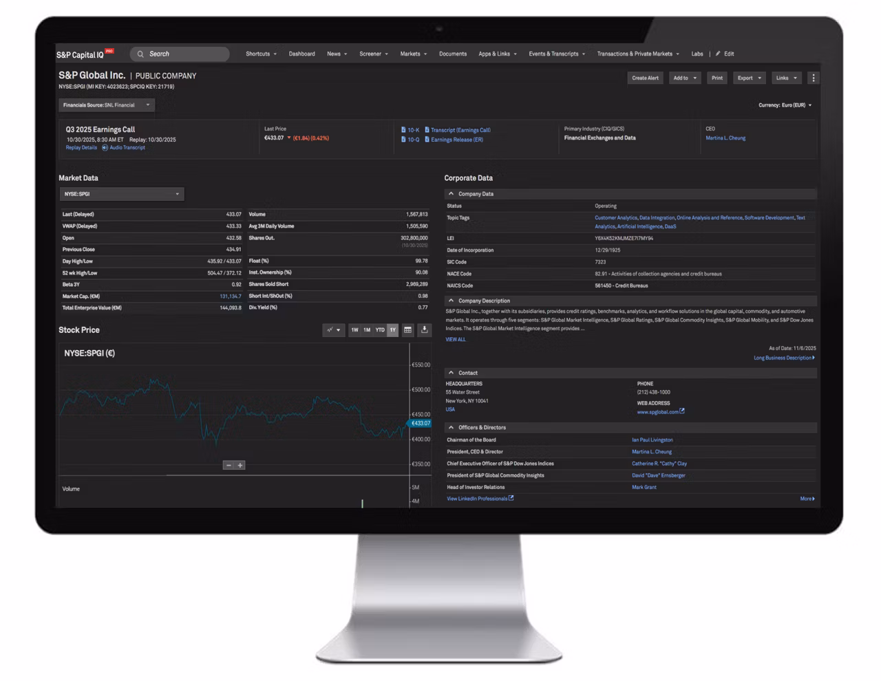
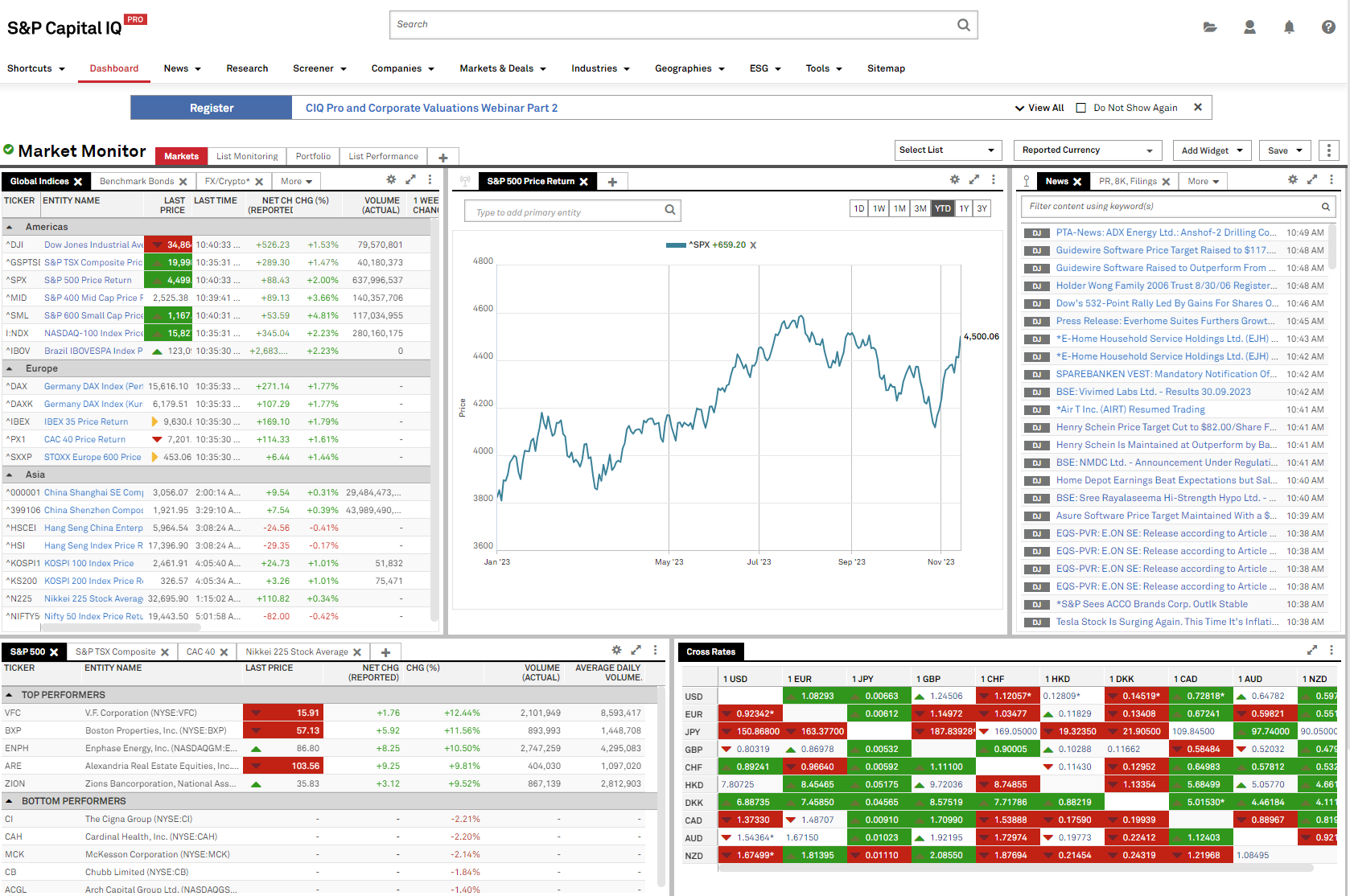
This project focused on redesigning Capital IQ Pro’s interface to improve usability and better connect users with its research tools and content. By simplifying navigation and modernizing key features like dashboards, news, and screeners, we created a more intuitive and engaging experience. The result helps users access insights more easily while encouraging deeper exploration of the platform.
Challenge: Capital IQ Pro offers powerful research tools to a global audience, but its interface made it difficult and overwhelming for users fully engage with the platform. The challenge was to redesign the experience in a way that balanced complexity with clarity. We wanted to focus on streamlining navigation, improving usability, and building trust. Overall, it was about guiding users to both the tools they rely on and new ones they may not yet be discovering.
Process: Commencing with collaborative brainstorming sessions provided an opportunity to assess the platform and pinpoint areas of focus. Subsequently, we conducted thorough analysis of the platform, examining user experience, features, and functionality to highlight key areas of interest. Additionally, we researched analogous tools and experiences offered by competitors to glean insights on enhancing the Capital IQ platform. Finally, we delved into conceptualization, exploring diverse ideas aimed at enhancing both the user interface and overall user experience within the platform.
Images in order — 1. Collaborative brainstorm | 2. Platform analysis | 3. Concept creation
Competitor Analysis: We analyzed competitors to identify strategies that could improve Capital IQ Pro’s performance and user experience. Key takeaways included the importance of customization, efficiency, and intuitive navigation to help users quickly access relevant data. These insights informed a more personalized, streamlined experience that supports both familiarity and exploration.
Images in order — 1. FactSet | 2. AlphaSense
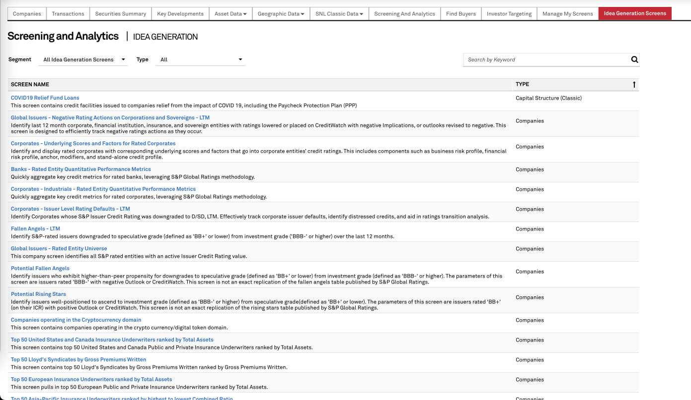
Idea Generation & Screeners Our team identified key areas to improve the platform, with my focus on redesigning the idea generation and screener tool. While powerful and highly customizable, the tool’s complexity made it difficult for some users to navigate. I worked to simplify the experience, making information more accessible while maintaining its depth. The goal was to create a more intuitive, personalized way for users to explore investment opportunities.
Images in order — 1. Original Capital IQ Pro - Idea Generation & Screeners | 2. Iteration one design | 3. Iteration two design | 4. Final version (default state) | 5. Final version (selected state)
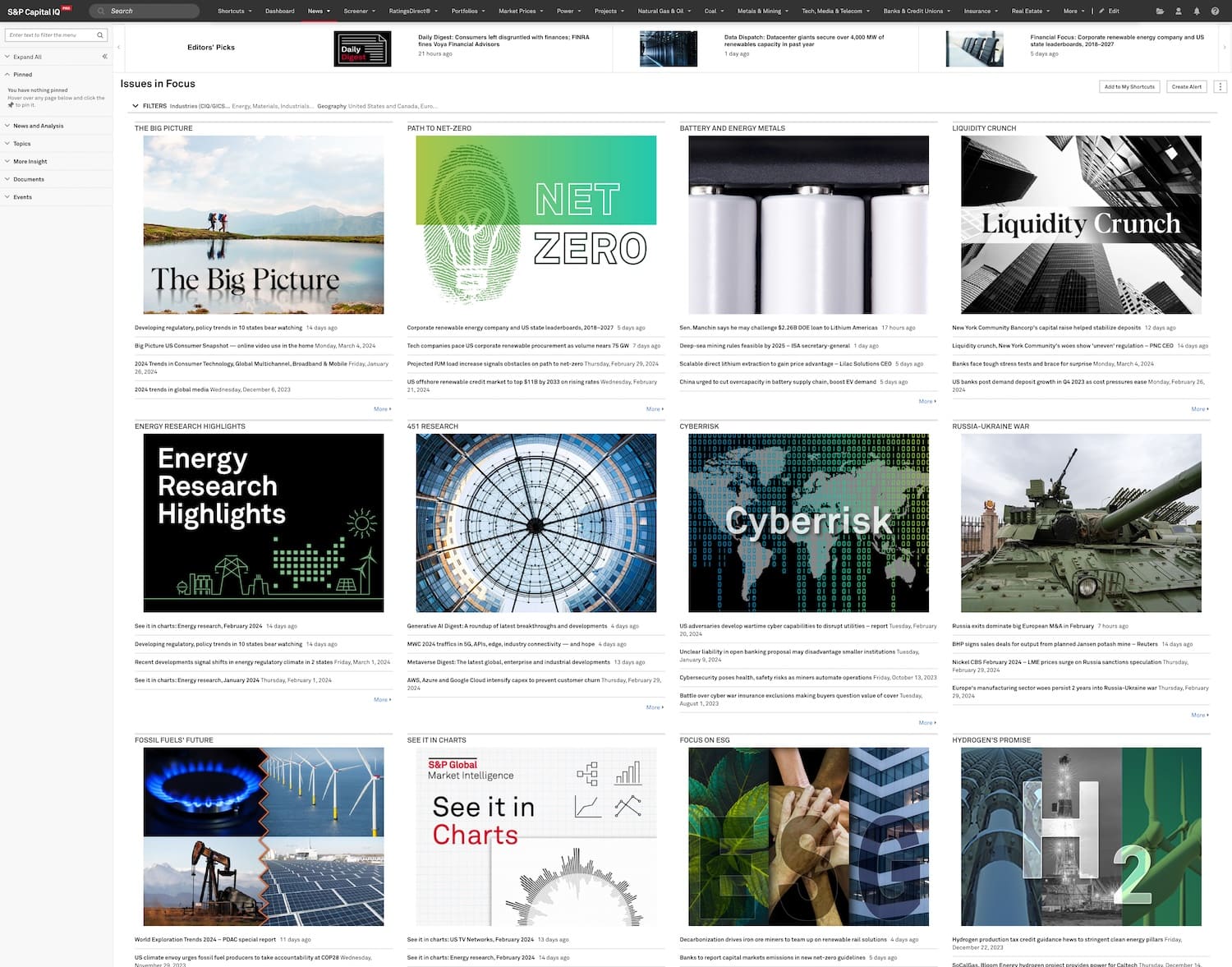
News: I also focused on improving the news section, which was previously overwhelming and lacked clear hierarchy, leading to low engagement. The goal was to streamline the experience by organizing content around user needs, categories, and relevance. By reducing clutter and introducing a clearer structure—along with filters and supporting market context—we made the news easier to scan, understand, and engage with.
Images in order — 1. Original Capital IQ Pro - News | 2. Wireframe for News layout | 3. Final design - My News dashboard and baseball card | 4. Final design - Top News | 5. Final design - My News (full width)


.jpg)


